Draw a Vibrant Poster/Banner by CSS | Brighten up by Css series
by Unknown in Brighten Up , css3 0
CSS has come a long way in recent years, and with new browser support
for a hand full of CSS3 properties we can begin to replicate design
styles directly in the browser that beforehand were recently only
possible in our design applications. Follow this walkthrough of the
making of Circlicious, a vibrant and abstract digital poster design made
purely of HTML and CSS.
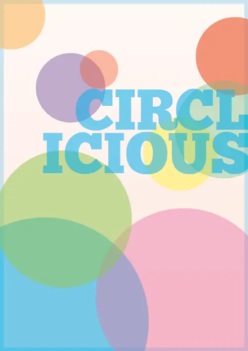
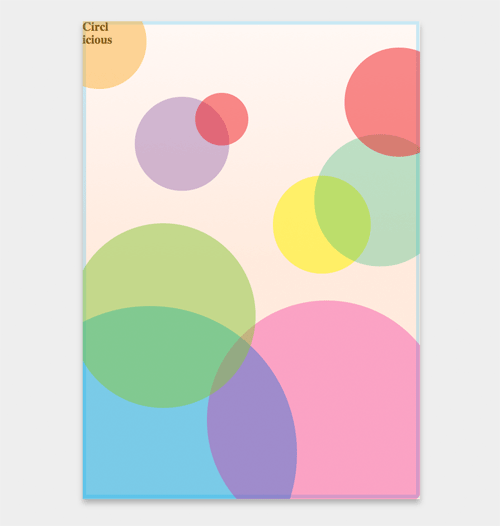
The Circlicious poster art makes use of plenty of circular geometric
shapes and features lots of transparency to add multiple levels to the
design, giving the design that bright and crisp feel of typical vector
artworks. Being a design that makes use of CSS3 properties, it’s only
suited to the modern browsers of Firefox, Safari and Chrome.
Creating the idea in Illustrator
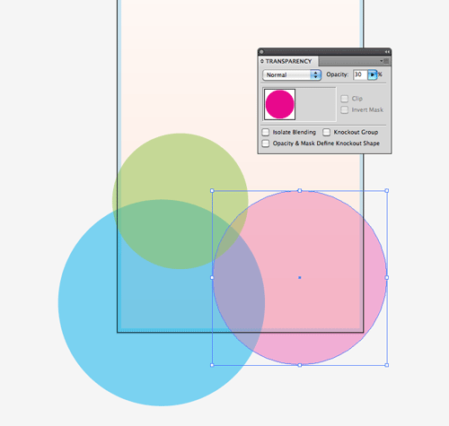
The initial idea and design concept was first laid out in Illustrator as reference for the HTML/CSS stages later. Multiple circles overlay with varying levels of transparency, allowing the colours to mix and change.
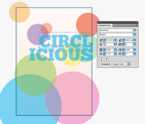
The slab-serif Chunk font is one that’s freely available for web use, so it was chosen to form the typographic part of the design.
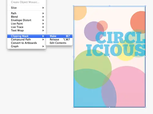
A Clipping Mask tidied up the final design concept, making it ready for colour samples and measurements to be taken.
The digital poster in HTML
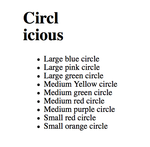
<!DOCTYPE html>
<html>
<head>
<meta charset="utf-8" />
<title>Circlicious CSS Poster</title>

<link href="style.css" rel="stylesheet" type="text/css" media="screen" />
</head>

<body>
 <div id="poster">
  <h1>Circl<br />icious</h1>
  <ul>
   <li>Large blue circle</li>
   <li>Large pink circle</li>
   <li>Large green circle</li>
   <li>Medium Yellow circle</li>
   <li>Medium green circle</li>
   <li>Medium red circle</li>
   <li>Medium purple circle</li>
   <li>Small red circle</li>
   <li>Small orange circle</li>
  </ul>
 </div>
</body>
</html>
<div>
with ID of “poster” contains the contents and acts as the overall frame
of the design. The typographic part of the design is placed first as a <h1>, followed by a <ul> with multiple <li>
elements to create the array of circles. Each circle is given a brief
description inside the list element, allowing the markup to relate to
the overall appearance of the design the best it can. Styling with CSS
body, div, h1, ul, li {
 margin: 0; padding: 0;
}

body {
 background: #eee;
}

#poster {
 width: 895px; height: 1266px; margin: 100px auto;
 position: relative;
 background-image: -webkit-gradient(linear, 0% 0%, 0% 100%, from(#FEEADE), to(#FEF8F5));
 background-image: -moz-linear-gradient(100% 50% 90deg,#FEEADE, #FEF8F5);
}
#poster div is given specific dimensions to create the portrait page layout, and moved into place centrally with margin:100px auto;. Being a containing element, position:relative;
is added to allow child elements to be positioned absolutely at the
later stage. The gradient background is then generated with CSS3
gradients. Two different declarations are need for both Webkit and
Mozilla, which both require different syntax. The CSS Gradient Generator comes in handy here.#poster ul {
width: 875px; height: 1246px;
border: 10px solid rgba(0,174,239,0.2);
position: absolute; list-style: none;
}
#poster ul is then styled with the same dimensions, and is given the 10px blue border. The rgba
value allows the colour to be specified in RGB format, with the A
representing an alpha level to reproduce the transparency effect. This
border was originally added to the #poster container, but
in order to tweak it to sit inside the dimensions of the page, rather
than on the outside, it needed to be added to a child element. #poster ul li {
text-indent: -9999px; position: absolute;
-moz-border-radius: 50%;
-webkit-border-radius: 390px;
border-radius: 390px;
}
text-indent:-9999px; to shift the text from within the <li> elements completely off the screen. position:absolute;
is set, which will then be tweaked on an individual basis to move each
circle into place on the design. To convert each list item into a
circle, the border-radius property comes in handy. Setting
the radius to 50% works perfectly in Firefox, but for Webkit browsers a
specific figure is required. The largest circle is 780px, so half this
figure is 390px. Although saying that, any large number would have been
sufficient, as once the radius reaches a perfect circle the radius
amount no longer has an affect.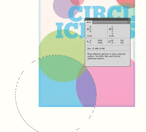
#poster ul li:nth-child(1) {
 width: 780px; height: 780px;
 bottom: -280px; left: -220px;
 background-color: rgba(0,174,239,0.5);
}
border-radius etc, more posh CSS3 selectors can be used to target each list element. The :nth-child
pseudo selector comes in handy to target the lists based on their
number, without the need of any classes in the HTML. The first list item
represents the large blue circle, so the size is measured from the
design concept and added to the CSS. The circle’s position is also
measured according to the page boundaries and added to the CSS. position:absolute; was added to the overall #poster ul li rule, so the actual positioning can be added directly to each item. Finally the color is added in rgba format as a background-color.
clip:rect(0px,895px,1266px,0px);
overflow:hidden; doesn’t do the job, but the CSS clip property works wonders. The clip is added to the parent #poster ul, creating a rectangle mask at the exact dimensions of the poster. Anything beyond this rectangular area is clipped.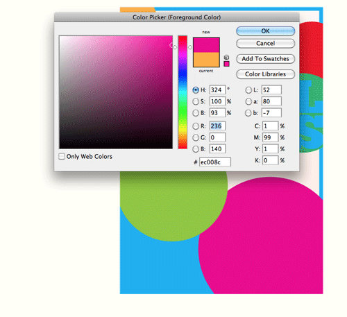
#poster ul li:nth-child(2) {
 width: 635px; height: 635px;
 bottom: -120px; right: -80px;
 background-color: rgba(236,0,140,0.3);
}
rgba transparency comes into play the colour will then match.
#poster ul li:nth-child(4) {
 width: 260px; height: 260px;
 top: 400px; right: 120px;
 background-color: rgba(255,242,0,0.5);
}
#poster ul li:nth-child(5) {
 width: 350px; height: 350px;
 top: 290px; right: -80px;
 background-color: rgba(43,182,115,0.3);
}
#poster ul li:nth-child(6) {
 width: 290px; height: 290px;
 top: 60px; right: -100px;
 background-color: rgba(237,28,36,0.5);
}
#poster ul li:nth-child(7) {
 width: 250px; height: 250px;
 top: 190px; left: 130px;
 background-color: rgba(102,45,145,0.3);
}
#poster ul li:nth-child(8) {
 width: 140px; height: 140px;
 top: 180px; left: 290px;
 background-color: rgba(237,28,36,0.5);
}
#poster ul li:nth-child(9) {
 width: 250px; height: 250px;
 top: -80px; left: -90px;
 background-color: rgba(252,176,64,0.5);
}
@font-face {
 font-family: Chunk;
 src: url("Chunkfive.ttf") format("truetype");
}
@font-face rule, the font-file can be referenced for supporting browsers to put it into effect. 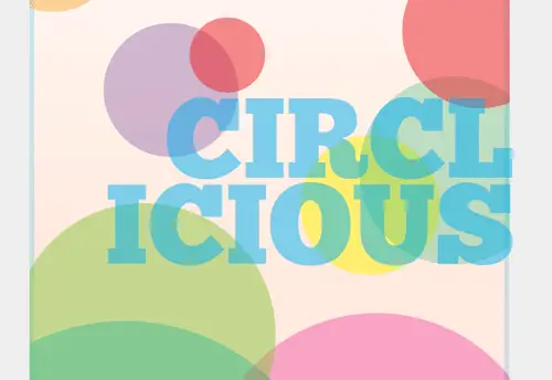
#poster h1 {
 position: absolute; top: 355px; right: -10px;
 font: 210px/160px  "Chunk", Helvetica, Sans-Serif; text-align: right; text-transform: uppercase;
 color: rgba(0,174,239,0.5); z-index: 10;
}
#poster h1 is then given absolute positioning and
moved into place in the mid-right portion of the design. A small amount
of negative right positioning aligns the text exactly on the page edge.
The Chunk font is then set with large fontsize and line-height, aligned
to the right and transformed to uppercase. z-index:10; is then used to ensure the text sits above the other elements.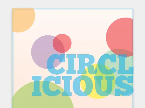
-moz-box-shadow: 0 10px 20px #b0b0b0;
-webkit-box-shadow: 0 10px 20px #b0b0b0;
box-shadow: 0 10px 20px #b0b0b0;
box-shadow is then added to the #poster rule to give a final visual effect, leaving the digital poster design complete.Demo