Sticky notes CSS3
by Unknown in Brighten Up , css3 0
I’ve been working on a pretty cool wall-mounted status board as one
of my projects at Fog Creek. It’s a webapp that runs on a vertically
mounted LCD screen in our office. It displays a bunch of interesting
information like tech support calls, staff vacations, tweets about
FogBugz, and more.
I’ve been incrementally adding features and improving the UI whenever
I have spare cycles. The other night, I decided to redesign the Kanban
board widget, which is a list of the top N things that the customer team
needs from engineering. I decided to go with a sticky note UI that
mimics a real-life Kanban board, which typically consists of a giant white board filled with a bunch of sticky notes.
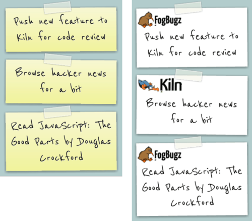
My initial design used the classic yellow sticky notes, which I
thought looked pretty neat. I showed my co-worker Rich who suggested
that we make the notes look like the FogBugz and Kiln notepads that are
laying around the office. Awesome idea! Way better.
Click here
to play around with the code yourself on jsFiddle. As you can see, the
implementation is pretty simple. CSS3 is really nifty. No images
necessary (aside from the kiwi and dodo logos).
Here’s the markup:
<link href='http://fonts.googleapis.com/css?family=Reenie+Beanie&subset=latin' rel='stylesheet' type='text/css'>
<ul id="notes">
<li>
<p>Push new feature to Kiln for code review</p>
</li>
<li class="kiln">
<p>Browse hacker news for a bit</p>
</li>
<li>
<p>Read JavaScript: The Good Parts by Douglas Crockford</p>
</li>
</ul>Now for the CSS3 magic:
body {
    background: #B2CCCC;
}

#notes li {
    position: relative;
    width: 300px;
    min-height: 100px;
    margin: 25px auto;
    padding: 60px 15px 15px 15px;
    background: #fff url(http://our.fogbugz.com/images/tbKiwiLogo.gif) no-repeat 4px 8px;
    -webkit-box-shadow: 0 2px 12px rgba(0,0,0,.5);
    -moz-box-shadow: 0 2px 12px rgba(0,0,0,.5);
    box-shadow: 0 1px 2px #000;
    -webkit-transform: rotate(-.5deg);
    -moz-transform: rotate(-.5deg);
    -o-transform: rotate(-.5deg);
}

#notes li:nth-child(even) {
    -webkit-transform: rotate(.5deg);
    -moz-transform: rotate(.5deg);
    -o-transform: rotate(.5deg);
}

#notes li.kiln
{
    background-image: url(https://rob.kilnhg.com/Content/Images/kiln_focus.gif);
}

#notes li p {
    text-align: center;
    font: normal normal normal 40px/48px 'Reenie Beanie', Helvetica, Arial, sans-serif;
    color: #000;
    text-shadow: white 1px 1px 0px;
    overflow:hidden;
}

#notes li::before {
    content: ' ';
    display: block;
    position: absolute;
    left: 115px;
    top: -15px;
    width: 75px;
    height: 25px;
    z-index: 2;
    background-color: rgba(243,245,228,0.5);
    border: 2px solid rgba(255,255,255,0.5);
    -webkit-box-shadow: 0 0 5px #888;
    -moz-box-shadow: 0 0 5px #888;
    box-shadow: 2px 2px 2px #000;
    -webkit-transform: rotate(-6deg);
    -moz-transform: rotate(-6deg);
    -o-transform: rotate(-6deg);
}

#notes li:nth-child(even)::before {
    -webkit-transform: rotate(6deg);
    -moz-transform: rotate(6deg);
    -o-transform: rotate(6deg);
}The tape is inserted using ::before and is absolutely positioned with a box shadow, slight rotation, and a semi-transparent background color (using rgba notation to set alpha transparency).
I hope you found this little technique useful. I’m going to be posting more about the big board soon. Stay tuned.