BEST 200+ Free Responsive HTML5 templates
A beauty drop down responsive menu that shows its sub menus with icon
symbol using open symbol fonts that allowing you to add more icons as
you want. With my previous tutorial, i also show how to create Creating 3-Level Responsive Drop Down Navigation Menu with jQuery and CSS3 as well.

Today we would like to show an experimental drop-down menu with
jquery and css3 using beautiful symbol fonts. The main idea is to help
you to save time for creating menus for website, it have a lot of
content and sub-levels. Some sub-level in this menu will be shown in its
context and icons. The menu is best use in professional web design that
it can be used easily in a responsive layout.
This Responsive Drop Down Navigation Menu using plugin such as:
In this article you will see that there are some amazing HTML5 and
CSS3 3D graphics examples with demo link. Usually, HTML5 goes hand in
hand with CSS3 to create the professional web experiences. In fact,
websites developed in HTML5 animation will not require adobe flash support on your Web browser anymore, provided that your browser supports HTML5.
Many people believe that HTML5 new advanced technology to create professional website
and animation templates on web online in stead of flash. HTML5 is a
lightweight, powerful and easy to use platform such as games, 3D
animation, 3D graphics by using HTML5 canvas, CSS3 and
JavaScript. In fact, HTML5 and CSS3 represents the future of mobile
browsing and that’s because of it’s comprehensive and lightweight
abilities.
CSS 3D transforms are smooth, hardware accelerated and simple to
implement, with browsers taking on what would be very difficult
perspective calculations.
Recommendation: For best results, please use a browser that supports
HTML5 and CSS3 such as Google Chrome, Latest Versions of Firefox or
Opera
by Unknown in Brighten Up , css3 0
Whilst this CSS3 declaration might not be crucial to your project or
design and yes it is not supported by all browsers, but it is a
fantastic effect that really takes your design one step further.
Currently FireFox, Safari, Chrome and Opera support the text section attribute, and the browsers that don’t support it simply ignore the code so nothing will break, so it doesn’t really matter.
We have setup a demo which you can test out further down the page; we have used the Design Juices colours in the example.
by Unknown in Brighten Up , css3 0
I’ve been working on a pretty cool wall-mounted status board as one
of my projects at Fog Creek. It’s a webapp that runs on a vertically
mounted LCD screen in our office. It displays a bunch of interesting
information like tech support calls, staff vacations, tweets about
FogBugz, and more.
I’ve been incrementally adding features and improving the UI whenever
I have spare cycles. The other night, I decided to redesign the Kanban
board widget, which is a list of the top N things that the customer team
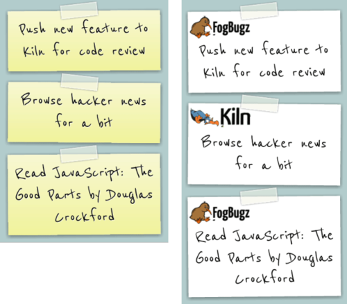
needs from engineering. I decided to go with a sticky note UI that
mimics a real-life Kanban board, which typically consists of a giant white board filled with a bunch of sticky notes.
My initial design used the classic yellow sticky notes, which I
thought looked pretty neat. I showed my co-worker Rich who suggested
that we make the notes look like the FogBugz and Kiln notepads that are
laying around the office. Awesome idea! Way better.

by Unknown in Brighten Up , jquery 0
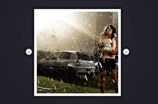
Today we are going to use jQuery and CSS3 rotations, along with the jQuery rotate plugin,
to create a beautiful slideshow. You can use it to spice up your web
sites, product pages and other projects with some CSS3 magic.

by Unknown in Brighten Up , css3 , jquery 0
In this tutorial we will see how to create a simple multi-step signup
form using CSS3 and jQuery. To spice up things a bit, we will include
progress bar with the form, so the users will be able to see the
percentage of form completion.
You can take a look at the working demo if you click on the image below: